An Overview of Data Comics and Their Effectiveness

There are many technical concepts that are quite tough for a layperson to understand. Most of these concepts are explained through visualizations, graphics, and maps. Just presenting data in front of an individual and letting him or her do the exploration doesn’t help. This doesn’t give any detailed insights into the data.
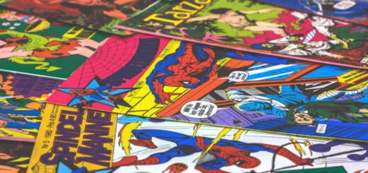
In order to communicate the insights to an individual, a story must be told along with the data. The only medium that has been used for many decades to tell stories graphically is comics. Everyone is familiar with comics, yet they’re rarely used for data-driven storytelling. This is where the need for data comics arises.
Data comics explained
Comics are an excellent combination of visual artistry, design, and narrative techniques. Their creation, therefore, requires certain skills that an average individual may not possess. Data comics are often added for giving a visual effect and driving engagement. They are created by combining multiple visualizations and involves the use of comic strips.
Such layouts comprise a sequence of panels and each of them has both textual and graphical elements. When arranged in a sequence, they form a story. Using this story, complex data is presented in a way that’s interesting as well as entertaining.
The key aspects of data comics
A data comic won’t be truly comic unless it leverages the visual language of the comics effectively. Designers can make data comics effective by including certain aspects that drive engagement:
1. Rendering and layout: Using cartoon-style rendering, clipped content can be redrawn by the designer to emphasize the comic medium. This would bring the audience into a comic state of mind. A pre-existing knowledge of comics would certainly help in this regard.
2. Comic characters: In a data comic, it is important to include characters that complement the visualization of data. Designers can refer a visual library of the characters. They can also make use of the best artistic talents to create the characters. The benefit of giving the story a human face is that it makes the narrative more personal and engaging.
3. Visual elements: The common visual elements utilized in comics can also be used to propel the narrative. Examples of this are highlights and motion lines. With the use of such elements, the attention of the audience is directed to specific parts of the visualization.
4. Thoughts, captions, and speech: In sequential art, the visuals are complemented by captions, speech balloons, and thought balloons. A data comic must also follow a similar format. This is extremely important in driving the story and guiding the reader.
Measuring the success of data comics
The ultimate purpose of creating a data comic is to convey the story to the audience. When it is finally presented, all of its panels must be visible. A single-panel navigation mode on the screen would serve this purpose. It helps the viewer to navigate backwards and forwards sequentially in the comic. The data comic thus created can be shared through social media or email lists.
Responses from the users would be crucial in understanding whether it was a success or a failure. If it fails, the teams involved in creating the data comic must try to understand where they went wrong. This would help them learn from their mistakes and make the necessary improvements.